Introduction
Cooking recipes are a fascinating type of data. A single recipe is rich in data; it has a list of ingredients, nutrition information(calories,fat,protein,sodium,etc), ratings, and in some cases, a site may even use tags to categorize their recipes. Ratings of food and their recipes seems almost completely subjective and up to the individual. Perhaps they depend simply on one's enjoyment of the dish or maybe the simplicity of a recipe. Either way, I'd like to make an attempt to look at recipes not from a subjective human standpoint but from a data-driven one. Other than being an avid cook, this topic piqued my interest because of how unique it was. From the structure of the data to the unpredictability of the relationships between variables, I'm excited to see what I can find.
Data Acquisition
This dataset was acquired from Kaggle.com, a popular data science site where users can share data sets and their explorations with them. This dataset was made by Kaggle user Hugo Darwood who scraped Epicurious, a cooking website/blog.
We should keep in mind that this dataset is from 2016 so some things may be outdated and alot of our findings will likely be catered specifically to Epicurious.
Packages/Libraries
Before we get started, let's establish the packages/libraries we will be using. Reasons for using each package listed next to it.
import pandas as pd # For general data representation
import numpy as np # For general data manipulation
import seaborn as sns # For graphing
import matplotlib.pyplot as plt # For graphing/combining different plots
from collections import defaultdict # For counting
from sklearn import model_selection # For split datasets for regression
from sklearn import linear_model # For regressions
import statsmodels.api as sm # For regressions
import statsmodels.formula.api as smf # For regressions
import sklearn.metrics as metrics # For regression metrics
import operator # for backward elimination efficiency
The Structure of the Data
We have 680 columns/variables. Title, rating, calories, protein, fat, and sodium are self-explanatory. All the other variables are tags. Tags are used by the website to categorize dishes. About 80% of them are ingredients. The rest are things like events, seasons, dietary restrictions, countries/states, etc. Some examples of these tags are sugar, #cakeweek, christmas, vegan, china.
# Read CSV file we got from Kaggle
food_data = pd.read_csv("food/food_data.csv", sep=',')
food_data.head()
Data Cleaning and Tidying
Here are the list of things we need to do about this dataset:
- Convert all the tag columns to be integers instead of floats for better performance and to better represent them as binary variables.
- Remove rows with unrealistic values for nutrition, "unrealistic" values listed as comments.
- Normally, we shouldn't just remove the rows with missing data(NaN) but it's hard to classify them as MNAR,MCAR, or MAR as we didn't handle data acquisition, so we will remove the NaN rows.
- It might be worth exploring the number of tags present in a recipe, so we will add that as a column.
- Remove title as it has no use in the data set.
# make all tags integers
integer_columns = food_data.columns[6:]

# Convert all the ingredients columns to be integers no floats for better performance and to better represent them as binary variables
temp = {}
for column in integer_columns:
    temp[column] = int
food_data = food_data.astype(temp)


# remove all rows with more than 10000 calories
food_data = food_data[food_data['rating'] >= 0] # Ratings should be between 0 and 5
food_data = food_data[food_data['rating'] <= 5]
food_data = food_data[food_data['calories'] < 10000] # anything above 10000, we'll consider an error.
food_data = food_data[food_data['protein'] < 5000] # anything above 5000, we'll consider an error.
food_data = food_data[food_data['fat'] < 5000] # anything above 5000, we'll consider an error.
food_data = food_data[food_data['sodium'] < 5000] # anything above 5000, we'll consider an error.

# Remove NaNs
food_data.dropna(inplace=True)

# Compile number of tags used in each row
tags = food_data.columns[6:]
row_counts = []
for index, row in food_data.iterrows():
    count = 0
    for tag in tags:
        if row[tag] == 1:
            count += 1
    row_counts.append(count)

# insert the new column at index 5
food_data.insert (5, 'tags_count', row_counts)

# Remove title as it has no use in the data set
food_data.drop(columns=['title'], axis = 1, inplace = True)
print(food_data.head())
Exploratory Data Analysis
Some Summary Statistics
First let's look at the distributions of all our variables:
Rating: seems to be normally distributed centered in the range 4 to 4.5. There are also some outliers near 0 but it's not enough that I'd consider it bimodal.
- Additionally, 1 to 3-star ratings are virtually non-existent.
Calories, Protein, Fat, Sodium: All seem to be normally distributed and skewed right.
- Sodium has a very wide range of values.
- Recipes tend to be very diverse in sodium levels.
- Protein, fat, and sodium tend to be closer to 0.
- Most recipes have very low amounts of protein, fat, and sodium.
- Calories has the most "normal" distribution and is centered around 400.
- Most recipes have on average 400 calories.
- Sodium has a very wide range of values.
Tag Count: Looks almost bimodal with the larger peak centered at 8 and the smaller peak at 15.
- This just means most recipes have tags that are around 8 or 15.
fig = plt.figure()
fig.subplots_adjust(hspace=0.4, wspace=0.4)
variables = ["rating","calories","protein","fat","sodium", "tags_count"]

fig.set_size_inches(18.5, 15.5)
for i in range(len(variables)):
    ax = fig.add_subplot(6, 1, i + 1)
    if variables[i] == 'rating':
        sns.distplot(food_data[variables[i]],bins=[0,0.5,1,1.5,2,2.5,3,3.5,4,4.5,5], ax=ax)
    else:
        sns.distplot(food_data[variables[i]], ax=ax)
    #ax.set_title(variables[i])
plt.show()
For our tag variables, the only summary statistics I could think of are the top 20 most popular tags.
tags_count = defaultdict(lambda: 0) # map to count ingrdients

# count each ingredient
for index, row in food_data.iterrows():
    for tag in tags:
        if row[tag] == 1:
            tags_count[tag] += 1
tags_count = dict(tags_count)
total_rows = len(food_data.index)

# sort them and change count to percentage
tags_count = {k: v/total_rows for k, v in sorted(tags_count.items(), key=lambda item: item[1], reverse = True)}# sort by count

# putting it into a list to ensure correct ordering(calling .keys()/.values can cause reordering sometimes)
plot_tags = []
plot_count = []
for k,v in tags_count.items():
    plot_tags.append(k)
    plot_count.append(v)

# set plot size and color scheme
sns.set(rc={'figure.figsize':(11.7,10.27),"axes.labelsize":2})
sns.color_palette("mako")
# Use seaborn to plot bar plot
plot = sns.barplot(x=plot_count[:20], y=plot_tags[:20])
plot.set_xlabel("Frequency in recipes",fontsize=20)
plot.set_ylabel("Tags",fontsize=20)
plot.set_title("Most Popular Tags",fontsize = 25)
Observations: It appears that the most popular tags tend to be related to dietary restrictions and can make up anywhere from 10 to 40% of most recipes. In case you are wondering why Bon Appetit is the number one result, Bon Appetit is the name of the popular food magazine that owns Epicurious so it's high frequency is expected.
Let's start exploring their relationships!
First, let's explore the relationship between Ratings and Calories/Protein/Fat/Sodium/Count of Tags. We'll make scatterplots using seaborn and they come with automatic regression lines. Something important to note is these visuals are not completely accurate. I've added jitters to the points which randomly spreads them by a certain range so we can see which parts of the scatterplot are more concentrated.
# We add the jitter to make the distribution of data points clearer, it does not influence the regression at all
fig = plt.figure()
fig.set_size_inches(18.5, 15.5)
fig.subplots_adjust(hspace=0.4, wspace=0.4)
predictors = ["calories","protein","fat","sodium","tags_count"]

# For each predictor, make a subplot and add jitters to it
for i in range(len(predictors)):
    ax = fig.add_subplot(3, 2, i + 1)
    ax.set(ylim=(0, 8))
    if predictors[i] == "tags_count":
        sns.regplot(x="tags_count", y="rating", data=food_data, x_jitter = .45, y_jitter = .45, scatter_kws={"color": "blue"}, line_kws={"color": "red"}, ax=ax)
    else:
        sns.regplot(x=predictors[i], y="rating", data=food_data, y_jitter=.2, scatter_kws={"color": "blue"}, line_kws={"color": "red"}, ax=ax)
    ax.set_title(predictors[i], fontsize = 20)
    ax.set_ylabel('Ratings', fontsize = 15)

plt.show()
Observations:
- It's hard to see how much each predictor affects ratings simply from the slope of the lines as they all operate on different scales with different units.
- E.g an increase in 1 tag is not comparable to an increase in 1 gram of sodium when talking about their impact of rating.
- It looks like these relationships are linear and we will not need to use polynomials for regression.
- Calories,Protein, and Fat seem to have a positive correlation with Ratings and very large spreads so they are likely to be poor predictors.
- Sodium and Tags Count seem to have a positive correlation with Ratings and a small spread. These are likely to be better predictors.
Multiple Linear Regression
The graphs before were simple linear regressions. They were plotted with only 1 predictor and 1 response. Therefore, our previous results may not be that accurate, so let's plot a multiple linear regression. I like to structure all my regression models in the form of a question for easier interpretation, so let's jump right in!
Question: Can we predict ratings using just nutrition information(calories, protein, fat, sodium)?
- First, we need to split the data into a training set and a testing set. We'll use the training set to build the model and the testing set to evaluate it's predictive performance. We are using 80% of our data for the training and 20% for the testing.
- Next, we'll be using the statsmodel package to run a regression. We are using Rating as our dependent variable and Calories, Protein, Fat, Sodium as our predictors.
# separate tag columns for future use
tags = list(food_data.columns[6:])
# use separate data table instead of main one
X = food_data[['calories','protein','fat','sodium','tags_count'] + tags]
Y = food_data['rating']
# split data into 80% and 20%
X_train, X_test, Y_train, Y_test = model_selection.train_test_split(X, Y, test_size=.2)

X_temp = X_train[['calories','protein','fat','sodium']]
Y_temp = Y_train

# Fit the Linear Regression on Train split
model = sm.OLS(Y_temp, X_temp).fit()
model.summary()
Observations:
- From the t-tests of our predictors, it seems all of our variables are significant predictors.
- From the coefficients, calories and sodium contribute to a higher rating while protein and fat contribute to a lower rating. Note that this is different from our previous observation.
- The R-squared of the value is about 50%, meaning our model only explains the variance of only half the points which is a sign that our model's predictive power is not very good.
So our model isn't the best but let's try using it to predict anyways. Two of the most popular metrics used to evaluate the predictive performance of a regression are MAE and RMSE.
Mean Absolute Error(MAE) is the average amount our prediction differs from the actual result.(We'll use this mainly as it is easier to interpret)
Root Mean Square Error(RMSE) is the average of the squared error. RMSE compared to MAE penalizes large errors far more.
# only pick nutrition information for this regression
X_temp = X_test[['calories','protein','fat','sodium']]
predicted = model.predict(X_temp)
actual = Y_test

# Get MAE and RMSE
mae = metrics.mean_absolute_error(actual, predicted)
rmse = np.sqrt(metrics.mean_squared_error(actual, predicted))
print("MAE:",mae,"RMSE:",rmse)
From our MAE result, our model on average predicts ratings with an error of 2.47(and our Rating's only go from 0 to 5 so it's around half of our entire range!). Our model is predicting things very inaccurately.
Decision: No, nutrition information alone is not enough to predict Rating but let's try again with more variables.
New Question: Can we predict ratings using nutrition information and the count of tags?
# only pick non-tag predictors for this regression
X_temp = X_train[['calories','protein','fat','sodium','tags_count']]
Y_temp = Y_train

# Fit the Linear Regression on Train split
model = sm.OLS(Y_temp, X_temp).fit()
model.summary()
Observations:
- From the t-tests of our predictors, it seems the number of tags as a predictor is also significant.
- The R-squared of the value is about 80%. This is a big improvement in our model
# get the testing data for the variables we used
X_temp = X_test[['calories','protein','fat','sodium','tags_count']]
predicted = model.predict(X_temp)
actual = Y_test

# Get MAE and RMSE
mae = metrics.mean_absolute_error(actual, predicted)
rmse = np.sqrt(metrics.mean_squared_error(actual, predicted))
print("MAE:",mae,"RMSE:",rmse)
This time our MAE is a lot lower but it is still fairly high. It is predicting ratings and being off by 1.3.
Decision: Technically, yes we can but the predictive accuracy is not very high. We can do better, let's now try including the tags as categorical predictors.
New Question: Can we predict ratings using nutrition information, the number of tags, and specific tags?
- We are using Rating as our dependent variable and Calories, Protein, Fat, Sodium, the number of tags and almost 700 tags as our predictors.
- Odds are, a lot of those tags will not be significant predictors. To make the best model, we will remove the variables that are not significant. There are many methods for variable selection but I will be using Backward Elimination to remove all variables below 5%. After removing or inserting variables in a model, it needs to be refitted so expect the code to take a while like 10 minutes to finish.
For more info on Backward Elimination, I recommend checking out this Towards Data Science blog which explains it pretty well. Variable selection methods are extremely useful especially when building regression models.
# Made a copy because we are going to be removing variables as we go
X_temp = X_test.copy(deep = True)
Y_temp = Y_test.copy(deep = True)

# Helper method for Backward Elimination
def remove_most_insignificant(df, results):
    # use operator to find the key which belongs to the maximum value in the dictionary:
    max_p_value = max(results.pvalues.iteritems(), key=operator.itemgetter(1))[0]
    # this is the feature you want to drop:
    df.drop(columns = max_p_value, inplace = True)
    return df

insignificant_feature = True

# Backward Elimination Code
with np.errstate(divide='ignore',invalid='ignore'):
    while insignificant_feature:
            # fit regression
            model = sm.OLS(Y_temp, X_temp)
            results = model.fit()
            # find significant variables
            significant = [p_value < 0.05 for p_value in results.pvalues]
            if all(significant):
                insignificant_feature = False
            else:
                if X_temp.shape[1] == 1:  # if there's only one insignificant variable left
                    print('No significant features found')
                    results = None
                    insignificant_feature = False
                else:
                    X_temp = remove_most_insignificant(X_temp, results)
    print(results.summary())
Observations:
- Only 88 out of our 680 of original predictors, which is about 14%, were significant predictors.
- Protein, Sodium, and the number of tags seem to be significant predictors in our final model.
- The R-squared of the value is now 90%, meaning our model explains most of the variance. This is a good sign.
- The AIC and BIC score(which can be used to compare models) is significantly lower compared to our previous 2 models. So this model can be considered far better.
- In the footnotes, they mention we potentially have multicollinearity issues. For our data, this is likely true but for the simplicity of this project we won't try to address it because it's going to take a whole blog post to talk about it. Instead, if you are interested in what multicollinearity even is and how we can fix it, checkout this Towards Data Science blog.
# Get predictors that weren't remove by Backward Elimination
filtered_predictors = list(results.params.index)
X_temp = X_test[filtered_predictors]
# Predict using test data
predicted = results.predict(X_temp)
actual = Y_test

# Get MAE and RMSE
mae = metrics.mean_absolute_error(actual, predicted)
rmse = np.sqrt(metrics.mean_squared_error(actual, predicted))
print("MAE:",mae,"RMSE:",rmse)
Our MAE is a lot lower now. Our predictions of rating are only off by 0.9 which is a lot better compare to what we started with! There are probably more things we could try to improve the model, but I'll stop here.
Decision: We originally asked if we could use ALL of our predictors, so the answer is no. But we can use protein, sodium, the number of tags, and 85 of the tags to predict ratings with a relatively high accuracy.
So what tags contributes to higher Ratings for cooking recipes?
d = {'predictor': results.params.index, 'coefficient': results.params.values}
df = pd.DataFrame(data=d)

df.sort_values(by = 'coefficient', ascending = False, inplace = True)

sns.set(rc={'figure.figsize':(11.7,10.27),"axes.labelsize":2})
sns.color_palette("mako")

top_10_bottom_10_predictors = list(df['coefficient'][:20]) + list(df['coefficient'][-20:])
top_10_bottom_10_coefficient = list(df['predictor'][:20]) + list(df['predictor'][-20:])

plot = sns.barplot(x=top_10_bottom_10_predictors, y=top_10_bottom_10_coefficient)
plot.set_xlabel("Effect on Rating when Present",fontsize=20)
plot.set_ylabel("Tags",fontsize=20)
plot.set_title("Top and Bottom 20 Most Influential tags",fontsize = 25)
The Big Winners 
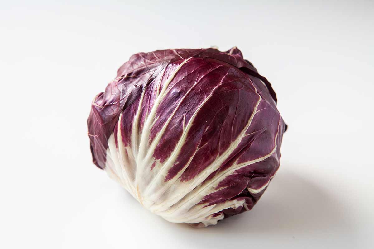
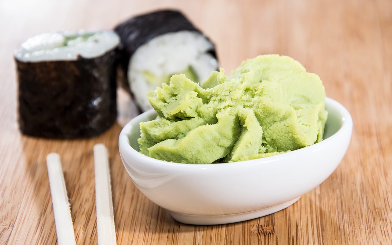
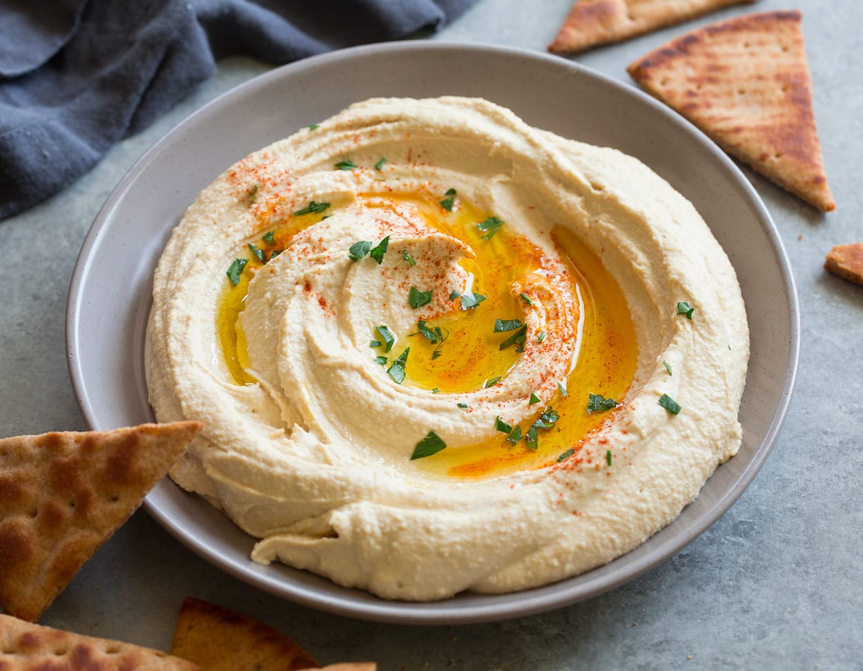
Radicchio, Wasabi, Hummus 
 |
 |
 |
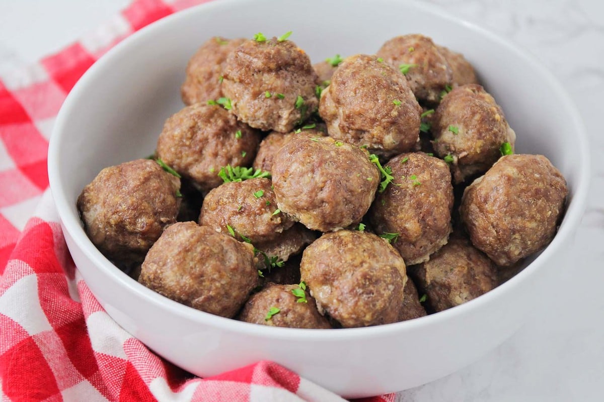
The Biggest Loser: Meatballs? 

Interesting Observations:
When Meatball is included as a tag in a recipe, it's rating is expected to go down by -5.59! This number is surprising especially when you consider Rating is only between 0 and 5. The only explanation for why it's greater than 5 that I can think of is that other tags present for meatball recipes tend to boost it's rating up.
The top 3 tags(radicchio,wasabi, and hummus) could be categorized as healthy and trendy ingredients(this is just speculation though). While there isn't enough data to make any conclusions, it's possible the healthy and trendy cooking reflects the Epicurious userbase.
Users also seem to rate 22-minute recipes higher.
Alcohol seems to be an influential tag in general. 7 of the bottom 20 are alcohol related: gin,liquer,spirit,apeitif,campari,chartreuse,spritzer. 3 of the top 20 include whiskey, fortified wine, and margharitas.
Jicama and Cardamom are associated with lower ratings and from a quick Google search both are somewhat "acquired tastes".
There is a lot of weird randomness in the data. I'll mention this in my reflection but I really wish there was an easy way to categorize the tags as I feel it will help me make sense of these odd observations.
- Events/Occasions like Diwali, Christmas Eve, St Patricks Day, Mother's Day, Mardi Gras, and Halloween have a surprisingly large impact on ratings.
- Philippines is the only location tag considered significant and it's associated with lower ratings.
Conclusion and Reflection
I said at the start that cooking recipe ratings were subjective. From our analysis, I think you could agree that predicting recipe ratings with high accuracy is hard. Compared to something very numerically driven, when working with a very human topic like food, a data-driven solution may not be the best approach. However, I'm sure we've gained some interesting patterns that would not be easily discovered.
We also got to go through the entire data science process. From cleaning the data to some initial analysis, we dived headfirst into regression and steadily build regression models, each one better than the last.
This project's greatest challenge was cleaning the data and handling the large number of predictors. I also first did the project with only the ingredient tags but it introduced a lot of bias in my statistics so I decided to keep them.
I like to end all my projects with things I'd do if I had more time. Here are a list of things I'd like to do:
- Making my own scraper would have been ideal. Understanding, formatting, and cleaning the data would have been easier and I also would have gotten more up-to-date data.
- I should have gotten more sources of data if my theme was cooking recipes. Without a doubt, a lot of the data and results were biased towards Epicurious.
- Finding a more efficient yet effective variable selection method. Forward Selection or Stepwise Regression would be interesting to test out.
- Categorizing the tags. Unfortunately, there is no easy way to categorize the tags and there are too many of them to do it by hand. I'm confident that if we could categorize them, we would see even more interesting patterns.
If you've made it to the end, thanks for reading everything. As a token of my appreciation, here's a video of a pumpkin guy eating stuff.
